Find fresh grocery products at a lower price than any other supermarket.
After a hectic day schedule and in a busy lifestyle, we don’t get much time for marketing and grocery shopping. Even a household person didn’t have that much time to go buying every time.
Most of the time it happens, when we go for cooking and find the missing ingredients and imagine that to get delivered at doorstep at our preferred time, that also without paying much.
About Vgetfresh:
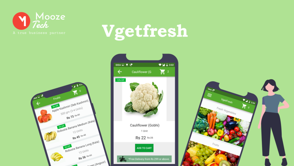
Vgetfresh, as name state itself, it’s a grocery shopping app that allows a user to get fresh grocery products at doorstep, anytime, anywhere with an immense range of vegetables, fruits, Bakery and organic Products at lowest prices. ‘Vgetfresh’ offers a wide range of grocery products like fresh vegetables, fruits and bakery products at a lower price rather than the supermarkets. A customer can avail free and an hours delivery on the minimum order of 299. It helps a user to perceive a hassle-free and convenient shopping experience.
The requirement to come with this app:
As a working person, sometimes I also feel that I have to drop some of my cooking plans, just because I don’t have the necessary ingredients at the moment, and being exhausted for the entire day it’s difficult to get that courage to go outside for buying those ingredients. It can be peculiar, but commonly most of the people suffer the same difficulties, also who are staying at home face the same, in their day to day life. In this scenario, Vgetfresh app is really helpful, that allows a person to eat their desired meal by delivering that required grocery product within a preferred time frame additionally with cash on delivery option.
What was the client asks:
Our super enthusiastic team had a warm session with our client when he comes with this idea. They discussed everything, including how to make this app more accessible and user-friendly than others. Our client’s purpose behind the Vgetfresh shopping app was to provide users with fresh vegetables and required grocery items on time, at the lower cost.
So before start working on the app, we surveyed to know the potential requirements and questions that come in a user mind while doing an online grocery shopping. This question was centred on online shopping, online grocery and about cooking behaviour like:
- As a user what difficulties you find while ordering online
- How often you do online shopping
- Do you always get fresh vegetables on the market
- What is a person’s view of the price and discounts?
Well, we can say this survey helped us a lot in narrowing down the basic needs of a consumer.
Our next approach to get all logo designing related answers like:
- What would be our tagline
- How we can create a unique and attractive logo design.
- Which colour will go well with the website and which images will be fitted properly with the team?
- What adjectives will describe this app properly?
- Exactly what message we want to convey with our users
- How the filter should work
- How we would like our topography to look alike.
After getting all these answers we start working on the development area.
And when the layouts had been created, the task was handover to the development team to implement it.
Development model:
As a developer team, our purpose was to come with an app that helps users to find and shop their required product with ease. Our passionate team has outlined the entire procedure and our illustration on a user flow chart has helped us a lot, to understand the user interaction with an app.
Finally, we are ready with ‘EASY TO USE GROCERY SHOPPING APP’ that offers a user-friendly interface and seamless supermarket shopping experience like:
* Add/remove items easily
* Reserve your delivery slot
* Shipping & Delivering order instant notifications
* One-click customer care call service
We kept this app very simple, so a user can experience an error-free shopping and it was an attempt to understand a persona and create an application to give our customers satisfaction while doing a grocery shopping.
Wireframe designing:
We wanted to create a UX and UI design. As a wire frame is an early step of creating UX and UI designs, and usability and efficiency of any website depend on this, we first focused on designing all the service at the structural level to know one account user needs and their journeys. We created a two-dimensional illustration of the page interface to understand space allocation and to priorities contents, and available functionalities.
What was the client’s reaction after completing the project?
The entire process was challenging and parallel joyful for all of our team. That turned into a great experience when our client has shown his happiness and satisfaction towards our app that has extensive functionality, influential usability and spontaneous appearance.


