Hyderabad is famous for several things, but most importantly for its variety of biryani.
It’s one of the most favourite cuisines among all others. The biryani inning serves various types of biryani with a regal touch. MoozeTech offered its Graphic Designing Services to “The Biryani Innings”.
Brief intro about The Biryani Innings:
The saffron and milk bring that tempt colour, and special seasonings add aromatic fragrance in the biryani that gives a royal taste and perception to the consumer. The tenderness of the meat used as the main component along with rice is the main ingredient to fall in love with the biryani. “The biryani Innings” combines all of this and serves at one place. However, “The Biryani Innings” is not just all about biryani it serves a wide range of cuisines including vegetarian foods.
Our Graphic Designing Services for The Biryani innings:
- This case study for “The Biryani Innings” graphic designing was a combination of explored concept around healthy eating and the restaurant’s unique approach to foodservice.
- The entire graphic designing services for Biryani inning was art with purpose. From a creative and systematic plan to solve a problem or achieve specific objectives, with using the relevant images, graphic design png, symbols and contexts.
- A method which we used: User interface (UI) and user experience (UX), Playful Illustrations, data storytelling, market research and analysis, competitive analysis, accessibility test.
Process involved in Graphic Designing Services
A well-defined logo and menu designing is a key element in branding. To come with the unique and rememberable logo and menu designing, our team needs to explore and think about the various designing and creatives like graphic designing wallpapers hd.
Logo designing:
As every graphic designer has an approach to logo development, our two team member has started working on this. Finally, their 60 minutes of concept development followed by 90 minutes of execution, our team come up with a perfect logo using graphic designing png and graphic designing wallpapers hd, that describes the preferences and general thoughts of our project.
We did several analyzing works to give the app that ideal look which we had in our mind. We used tools such as Adobe XD, Illustrator to develop a flow prototype in Invision.
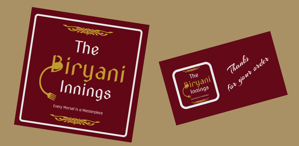
The process that we followed while working on logo designing
- Brand evaluation: First, we tried to understand what the brand embodies and what the business’s goals are. As most clients are unable to articulate what exactly is the approach, its work of a designer to gather the complete details, to draw the information out.
A few questions we asked our client:
- What exactly he is looking into the logo?
- What adjectives would he use to describe it?
- What are the beliefs and values of the brand?
- How does he want his customers to describe brand to their friends?
However, it’s not precisely a graphic designing services question, but considering the logo as the strongest vehicles for branding, it would be the first step in graphic designing services.
2.Industry research:
As every brand has to contend with the standards of their industry, its important to research what kind of logos competitors and industry leaders have.
It helped us to know:
- What logo techniques can work for our project i.e., brand colours or particular shapes
- What logo techniques are overused, to the extent that they lose personality?
- What customers look into a particular logo design.
-
Where a logo can be used: This also known as Application Discoveryphase. These are some common use cases for a logo design:
- Website icon
- Advertisements
- Social media profiles and banners
- Business cards
- Signs and banners
It helped us in logo shaping and to think beyond the standard logo designing.
- Sketching a variety of logo concepts: As we had the few logo ideas, instead of jumping ahead into logo design software, we decided to draw that to see how they look outside of our head using various graphic designing png.
Once we have settled on our preferred concept, we tried sketching some variations on it, by adding or removing elements, changing minor details, and beginning typography explorations.
- Digital drafting: From our rough work, we picked three our best work, And recreated them into our design software. In our digital draft, we did experiment with logo colours as well as typography.
- Feedback and refining work: We have some really talented critics in our team that we always appreciate. A fresh set of eyes on the final product always reveal some room for improvement that we hadn’t noticed before. But the real challenge lies in interpreting and acting on the client’s feedback. By considering the potential flaws and feedbacks, we articulated the reason behind our design.
7. Final delivery:
Now logo has finalized, and it’s time to deliver the final files!! Apart from determining what design files our client needs to start processing, we included:
- Layered source vector files, such as AI
- High-resolution raster files for web, including PNGs with transparent backgrounds
- Layered EPS/PDF files
- Graphic Designing PNG
- Graphic Designing Wallpapers HD
Insights into our logo designing:
The combination of Graphic Designs Wallpapers HD, Colours and Font styling with the perfect theme made the logo looks completely accurate.
Our Menu designing process:
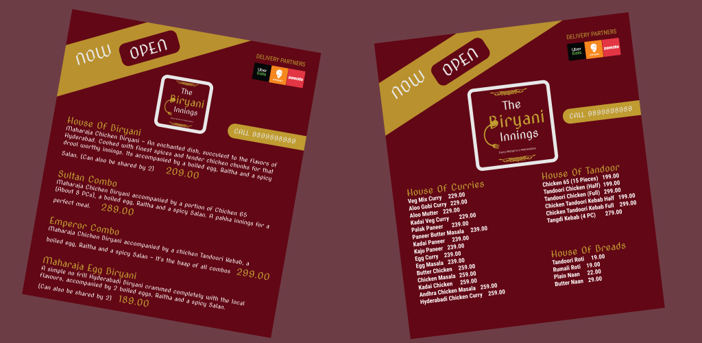
At very first, menu designing seems very simple, list the dishes, add a price and leave the decision making to the customer. In reality, its strategic and persuasive tool. A perfect restaurant menu design, menu layout & menu size guide a customer to make dining decisions with maximising profitability. We opt for the process that includes:
- Eye scanning pattern: Our study says that customers’ eyes get naturally drawn to the “sweet spot” in the upper-right-hand corner, and most of the menu their higher profit items there. However, according to the latest trend, customers read a menu like a book. So we kept it simple.
- Customisation: We make it easy for customers to search for dishes by arranging items sequentially and in logical groups.
- We described our specialties, including spices and ingredients.

Our client reaction:
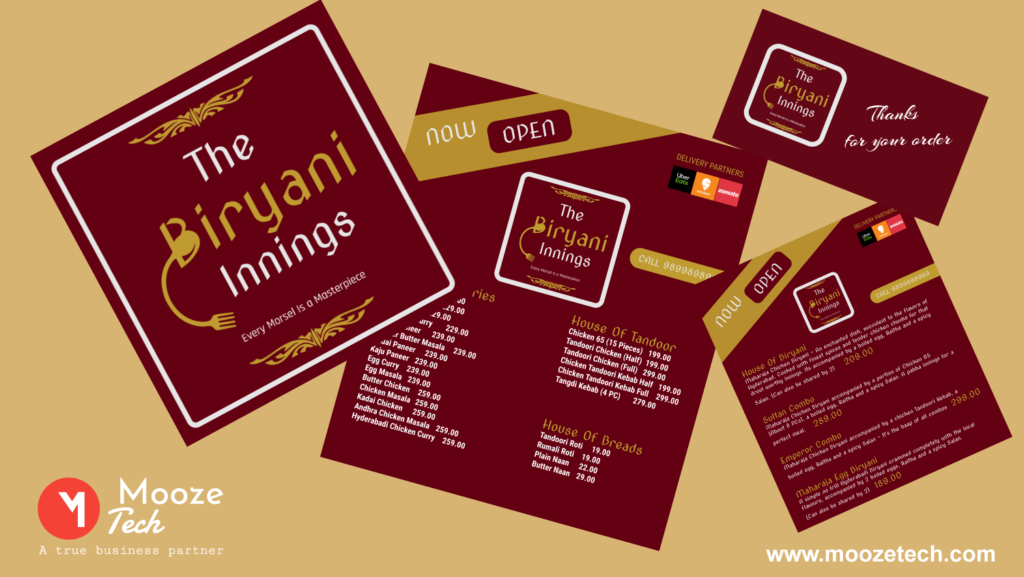
It was a learning experience for us, where our development team and client were on the same page throughout the designing process. Throughout the process, we were continually in touch with our client to discuss, improve and implement desired things before the final presentation. And of course, when we get to know that the entire graphic designing is precise as our client wanted that to be, was a great appreciation for our whole team.
This is quite detailed and discriptive information. Useful information for new people and explorers of cuisine .Much needed for city people.