Delivering food is a growing appetite dining industry, as a report says millennial are three times as likely to order in as their parent.
Food and cooking is an endless source of inspiration, to think and create much more than.
People may often think that what is need for more food delivery apps, as several are already there? it’s because the food industry is the fastest growing industry with countless opportunities and competitors have lots of business to gain.
About BeHunggry:
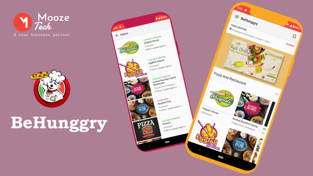
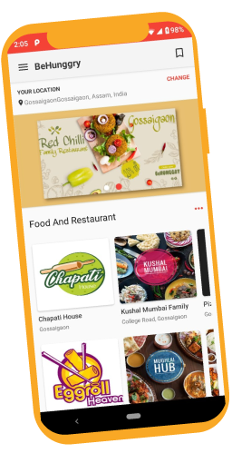
BeHunggry is a platform to serve people with a variety of food option, with a real-time tracking system, where a restaurant, chefs, delivery boys and customers play an essential role. Any person can browse easily their nearby restaurants by searching for their favorite cuisine, restaurant name, dish, meal, etc. and just by following few simple steps, you can get your food at your doorsteps.
The Behunggry comes with pick up option as well, you can order your food and as per the scheduled time, you can pick your order. It’ extended functionality allows users to order food from the menu, and you can also customize the ingredients option for yourself by adding or removing the ingredients. This app also provides an option to schedule the food delivery timing, according to your convenience.
The requirement of this app:
We understand that many food delivery apps are already available in the market, but we concentrated to make our application simpler, and accurate to the estimation, as it means a lot to a customer.
Designing a food delivery app needs to think about the variety of steps and clear navigation to ensure that users quickly make and get their order under all circumstances.
The client asks:
Normally a food ordering app for restaurants and cafes features the meals of the adjusted formulation, our client ask was to push that limit. He wants to open this field for customers they will decide what, when and where they want their food to be delivered, along with the multiple payment options.
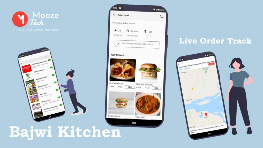
He wants keep the home page as a recommendation page, keeping the sensitivity between restaurants. Most of the customers get irritated by the inaccurate delivery time or poor navigation, so to make the app live to track.
Our input:
Users preferences mostly depend on the restaurants on a certain app, most of the people tend to order from a particular restaurant they already know.
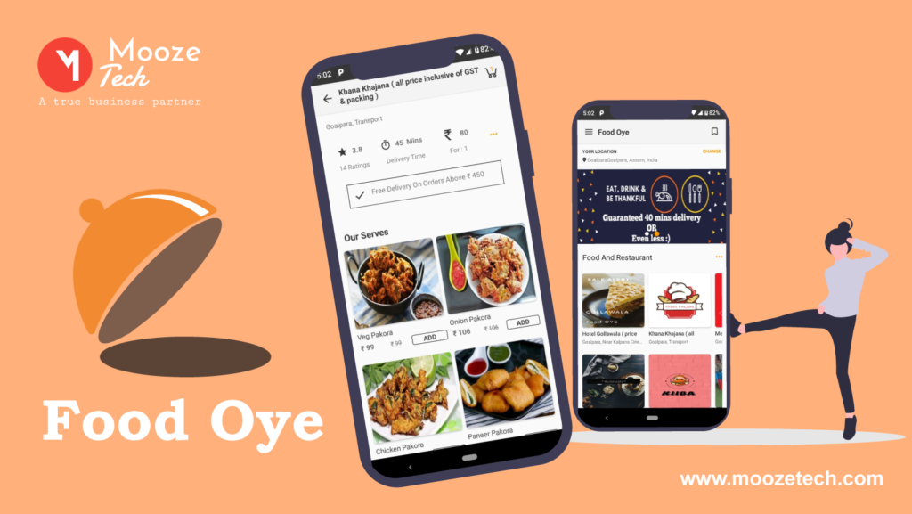
We tried to keep the customized restaurant’s list on the first page, depending on user’s behavior, to reduce the friction of purchase time. The menu shows the actual position and offers that is currently going on for a particular restaurant. We worked on color strokes highlight value and calls-to-action for quick scanning.
We tried to keep background contrast, observing and managing positions in the lists are displayed on the clear background to provide clear readability.
We kept in mind that hungry people do not want to devote much time on scrolling, so everything has to be shorted in seconds.
Wire frame work:
The Behunggry app design process was an exhilarating creative challenge for our creative team. For them, it has become a great attempt to expand the limits of a food delivery app with strong usability, functionality, and an attractive appearance. They start working on the low-fidelity wire frame, with versions of drafts.
After attempting to make it more and more user-friendly and attractive, they had shortlisted a few features to move on next high-fidelity digital mock up.
Prototype:
Since this program allows composing easy mock-up and proposition, we end up making our prototype . After setting the structure we start adding pictures and colors.
Takeaway:
We know that the food market will only be more crowded and more competitive, and to stand out of the crowd, we need to identify the valuable restaurants, and to increase customer’s satisfaction.
Earlier food delivery process comes with so many uncertainties that only frustrated to the customers.
It’s more crucial in this market to provide the customer with a platform from where they can order their favorite food easily with direct communication. we applied slight and unobtrusive animation to show transitions and micro-interactions, to give food ordering app design a lively appearance.
Features:

As per client requirement, we created below features to make an app easy and approachable:
-
Register/Login
-
Add city, location and new location
-
Menu with Food Images,
-
Price
-
Availability
-
Save User Information
-
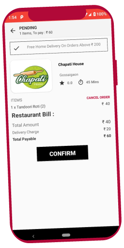
View Order Details
-
The restaurant receives the order.
-
Love order tracking
-
Schedule delivery time
-
Schedule pick up time
-
Add cooking instructions
-
Save payment option

Client reaction:
However, it was difficult to categories food listing into breakfast, lunch, and dinner and show them to the user as per time frame, and we also faced little complexity to develop it accordingly, but in the outcome, everything was perfectly aligned and the result was as unexpectedly good.
